I love the way this turned out. The color is gorgeous!
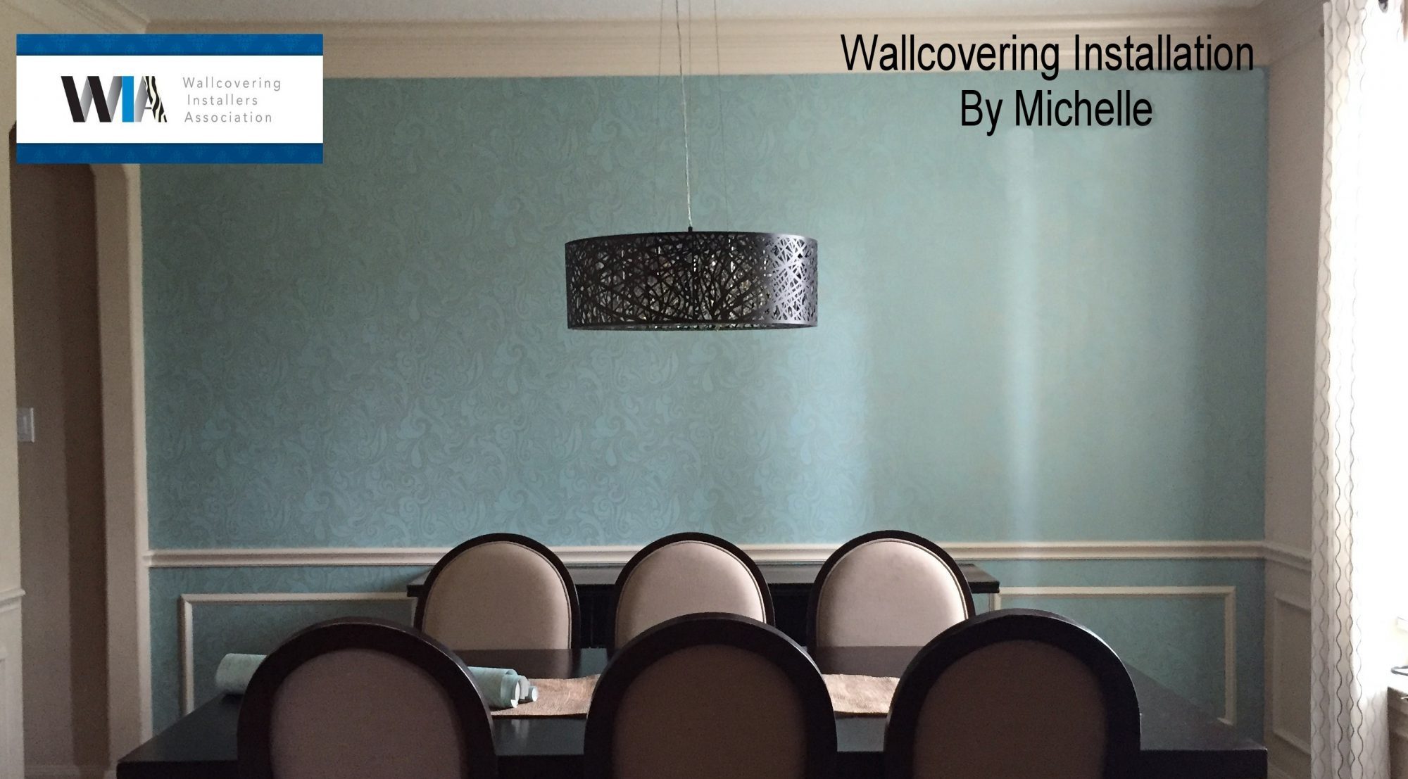
I love the way this turned out. The color is gorgeous!

I’m finally getting to post some pictures up of this job. I worked quite a while at this home and then I went right into a few more jobs so I couldn’t get my pictures sorted and sized for my Blog. I do not have all of them ready but I think this sampling will be plenty.
Considering the walls and rooms look pretty easy, the job was a bit slow. All the rooms had major wall prep issues to deal with. The main areas and halls had textured, glossy paint on them and the paper for those areas was very thin. That wallcovering also needed to be hand trimmed on both sides, which is a slow process. The bedrooms and baths had paper on them that did not want to come off. I took care of each room in the way that best suited the situation and hung lining paper in every one of them before installing any of the wallpapers.
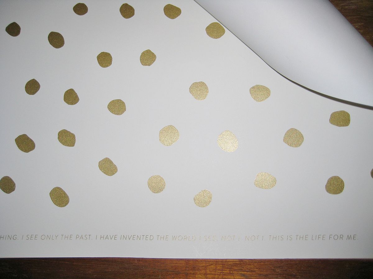
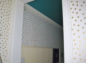
The paper used in both foyer areas and all the hallways is by ‘JuJu Papers’. This pattern is Sisters Of The Sun and the colorway is gold on cream. Owner Avery Thatcher is wonderful to work with and shipped very quickly, considering this is a hand printed material and made to order. Please check out the website if you are looking for some eclectic patterns that will go with almost any décor or style.
JuJu Papers is environmentally responsible in every possible way.
My client thought her rooms looked very ‘happy’ when all the papers were up. I think she’s right!
HERE IS THE PAPER FOR BOTH FOYER AREAS AND ALL THE HALLS:

I TOOK THESE TWO PICTURES THE DAY I MEASURED. NOTICE THE WOOD IS PAINTED WHITE AND THE CEILING IS LIGHT BLUE. I DID LIGHTEN THESE UP A BIT. THE WALLS ARE 9′ UP TO THE MOLDING.

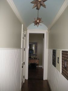
THEY HAD THE HALLWAY CEILINGS (AND MAIN LIVING AREA CEILING) PAINTED AQUA, AND THE WOOD A DARK BEIGE.
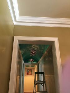
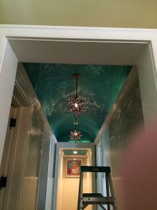
AFTER:
THIS IS THE HOW THE FOYER LOOKED BEFORE I STARTED:
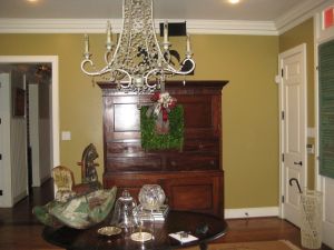
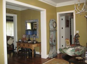
ALL PHOTOS BELOW ARE VARIOUS SHOTS OF THE WALLPAPERED FOYERS. YOU CAN SEE ONE OF THE HALLWAYS A LITTLE. THE HALLS WERE HARD FOR ME TO PHOTOGRAPH BECAUSE OF THE LIGHTING.


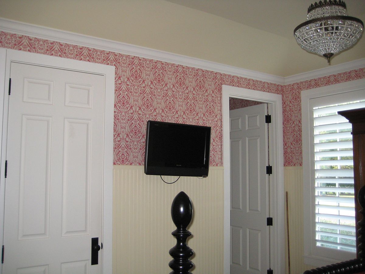
A GUEST BEDROOM:
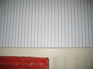
Above is the paper that was on the bedroom walls prior to the red pattern.


BATHROOMS:
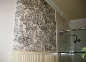
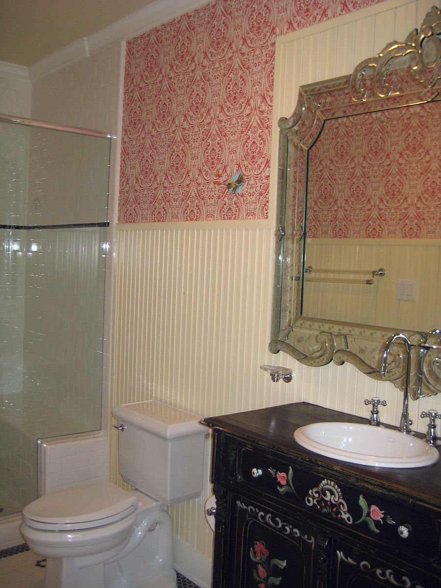


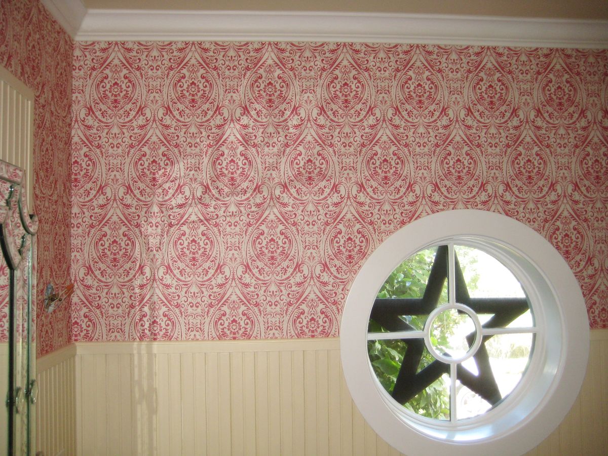
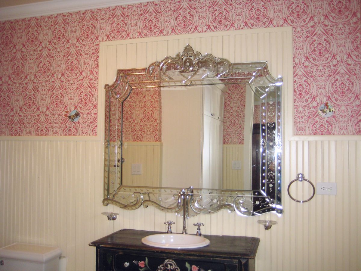

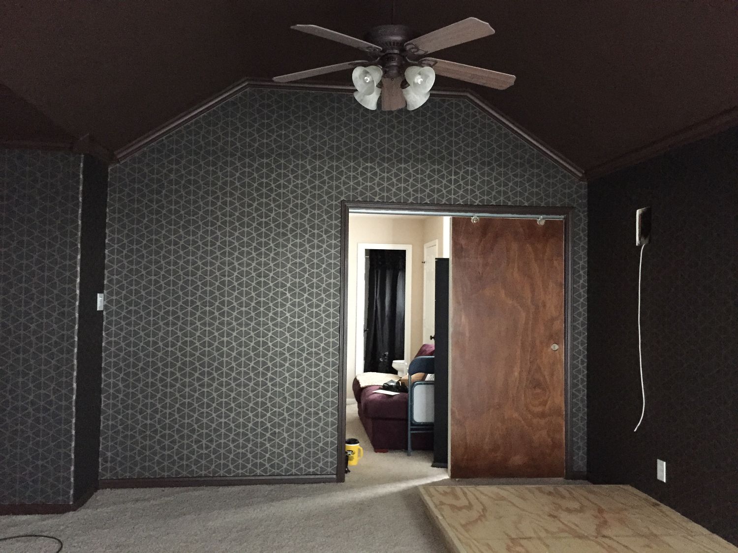
All of the walls were textured heavily, and painted, which required lots of priming and floating. The material is a heavy type ll commercial grade vinyl. It comes in 54” wide bolts and is sold by the yard. A 30 yard bolt is usually the largest size packaged at once. If you need 45 yards you would be sent a 30 yard and a 15 yard bolt. However they are not only wide but fairly heavy, making it difficult to handle. Normally you have to overlap the edges and, in this case, match it up precisely, then cut away the excess and make sure the seams go together without showing. To make it a bit more challenging, the instructions called for reversing each strip. Because it’s a geometric pattern I had other challenges as well. Of course there is much more to it which is why a professional installer is mandatory.
To sum it all up: my client’s theater room looks amazing and this pattern will be relevant for years to come.
Latasha and Tim if you read this I want you to know all my wallcovering friends really liked this material and the way your room turned out. Great choice!
I loved working for you – thanks for making my job a joy.


The wall below is the one that was added to transform the room from an open game room into a theater room. If I can get pictures once the room is completed I will add them to my Blog at that time.
*The furniture was moved out into the hall to make it easier for me to get around and set up my equipment. .

This Houston home was built in the late 1970’s and not one wall was straight. Some of the smaller areas were off by an inch from the bottom width of the wall, to top of the door frame, making a geometric pattern quite a challenge to hang. I did use a few ‘tricks’ to compensate where possible. Overall the room looks amazing. A great choice in wallpaper to match their grey, painted, wood paneling in the den.
Not shown: I also hung this same material in two bookcase areas in the den. One area held their TV and the other had shelves. It added a bit of pizzaz to the fireplace wall it was on and tied the whole look together giving an older home the face lift it needed for this young couple.
Info: Thibaut wallcovering pattern named ‘Ikat’. Shown here in the grey and white colorway.
You can reach me at: Paperhnger@aol.com (Yes, their is an ‘a’ missing)


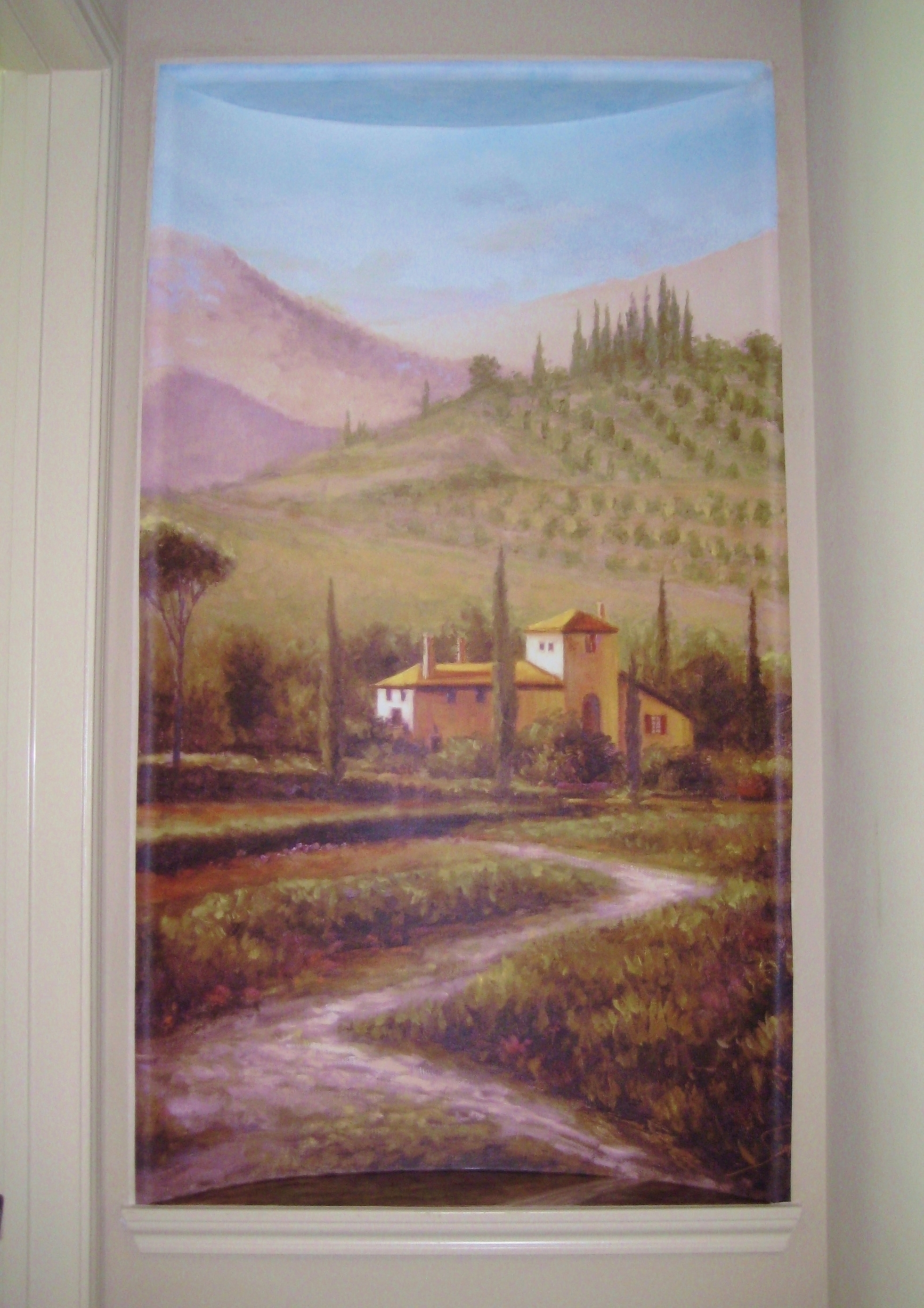
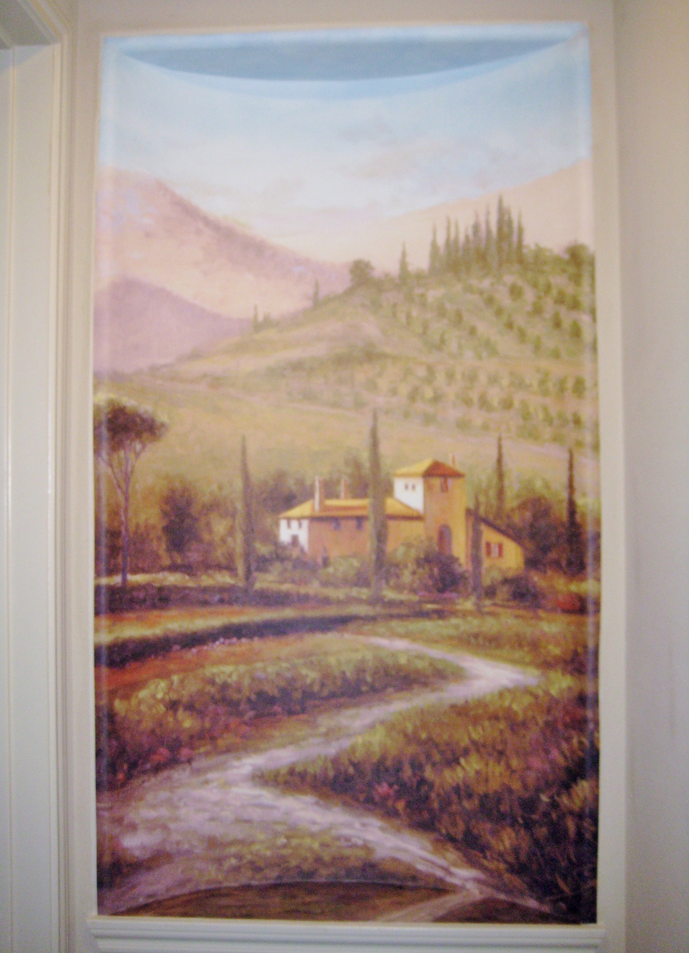
I recently hung a canvas mural in an Art Niche and then painted two areas to complete it. There will be a wood frame going up all around this making it look like a wonderful Artwork! The homeowner is also putting a small accent spotlight on the little hall ceiling to light it up.
The art niche had to be floated smooth first, then wet sanded, primed and blankstock was hung. Next I began to plan the placement of the canvas. This was hung with a heavy duty clay based adhesive.
The top portion I painted on a primed canvas, sealed it, then installed it. The bottom, extended portion of the scene, I painted on-site.
This canvas mural was very wide (but not much taller than the space). It had to be cut down and centered without compromising any of the scene. This was difficult because there were other trees on the sides we thought should be included but had to remove them.
All’s well that ends well however! It came out PERFECT!


Once again please excuse my awful photography skills. We can’t be good at ‘EVERYTHING’ now can we?
Have a wonderful day ~
Michelle
